Victorian Civil and Administrative Tribunal
Empathetic accessible advice for Victorians in dispute
-
Challenge Modernise and future proof a legacy site to be easy to navigate for public and staff alike.
-
Solution Audit content and craft a logical IA. Redesign site paying particular attention to accessibility needs of users.
-
Impact Sessions increased dramatically with more users being able to complete their tasks on the site.
The background
By the time someone in Victoria decides to visit the VCAT website, the odds are things are going pretty badly for them; their dispute is being taken to tribunal!
VCAT is the busiest tribunal in Australia, with close to 100,000 stressed-out Victorians visiting the website each year seeking assistance in resolving their dispute. Deliberately more informal than the courts, VCAT encourages people to represent themselves.
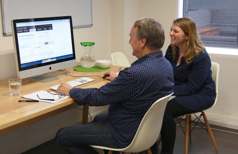
User testing the prototype to find out how useable the solution is
The challenge
The existing VCAT website provided a sub-optimal experience for visitors. The information architecture was complex and not designed around user needs, making it difficult to find relevant content. It was hard for administrators to maintain, and it displayed a number of usability issues. Additionally, the site was not optimised for small screen viewing, yet the statistics identified an increasingly mobile audience.
In many ways, this was the ultimate UX design challenge; Most visitors to VCAT only ever do so once in a lifetime, yet the process of coming to court is difficult to understand. This had to be a super-intuitive solution. Furthermore, the tribunal promotes low-cost, self-representation, so there’s a lot of important, yet typically complex information that needs to be mastered quickly. We had our work cut out with this one!
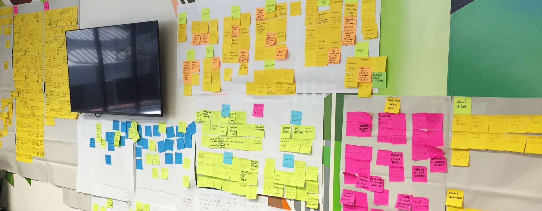
Outputs from a stakeholder workshop documenting user needs and goals
Our approach
Our work started with a series of workshops and interviews with key internal stakeholders and website users, an extensive heuristic review and a series of benchmark, moderated user tests to better understand the existing landscape.
Our solution
Having gained a deep understanding of the various user groups’ needs, we set to work making sense of the wealth of data at our fingertips. Working closely with our client, we co-designed a new solution from the ground-up, starting with an extensive content audit and Information Architecture redesign and ending with a detailed wireframe prototype that was used to test and iterate the design.
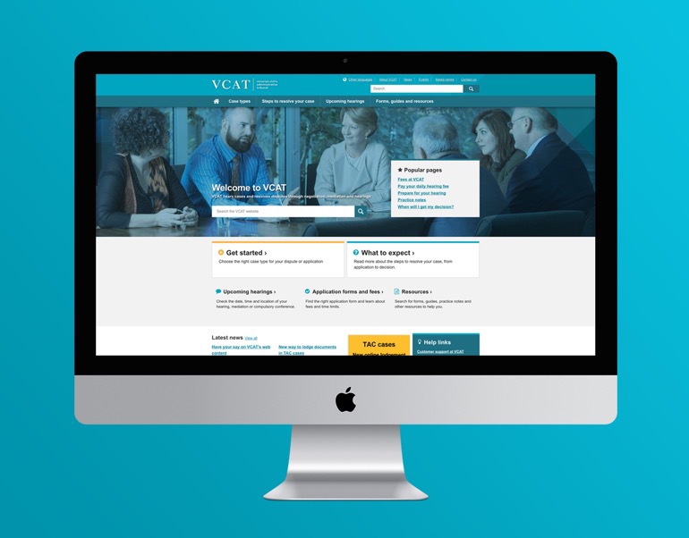
Finally, drawing from the outputs of the preceding phases, we designed and developed the solution in line with the organisation’s brand style-guide using the responsive web design methodology to accommodate a variety of screen sizes and resolutions. Given the breadth and diversity of the audience, accessibility considerations were of the utmost importance, so particular attention was paid to testing and reviewing the site in this regard, ensuring AA standards were met throughout.
Deliverables
The impact
The new VCAT website launched in July 2016 to great success and has quickly become a key part of their VCAT service offering. Both the business and it’s community have responded positively to the site, which is now providing a much better experience for both.
-
Bounce rates-40%
-
Sessions71%
-
Session times27%